The best examples of this were in the local city council offices. However, the prevalence of security cameras made me reluctant to take photos, so I'll have to tell, rather than showing:
MOBILE PHONE USERS
COULD ALL USERS OF MOBILE PHONES
PLEASE HAVE RESPECT FOR OTHER
CUSTOMERS AND KINDLY REFRAIN FROM
USING THEM WHILE CARRYING OUT
TRANSACTIONS AT THE COUNTER.
THANK YOU
Let's put aside the fact that they really shouldn't be using other customers at all, and focus instead on the overall message.
What they really want to say is "hang up your damn phone," but obviously that's much too brusque. But adding the pleases and kindlies and thankyous--and printing THE WHOLE THING IN CAPS--just means more words to wade through to find the useful part. By which time your phone has started playing the Crazy Frog and you're next in line.
And for those who like to believe the British education system is substantially better than that in the US, here's more evidence to suggest otherwise.
Left luggage office at Heathrow Airport (Terminal 3, Arrivals):

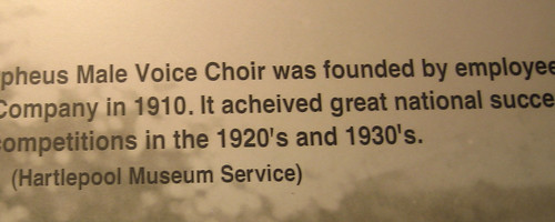
Photo caption at the Museum of Hartlepool:

(My mum found that one, so she gets to be Deputy of the Week!)
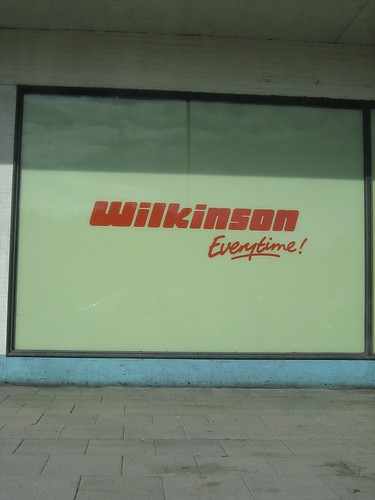
In a store window, also in Hartlepool:

Apparently it's not enough to mangle the use of "everyday" ...
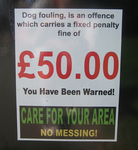
Finally, a twofer--too many words and poorly punctuated:

Does "dog fouling" refer to making sliding tackles on terriers?
Copyeditor General's ruling: Evidently the problem is greater than I thought. We need to install a CG at the EU.


No comments:
Post a Comment